Navigation
Twitter and News feeds
Search this site
Networked Blogs
« I'm surfing on the inside | Main | Not the Dry Tortugas, as such... »
Wednesday
Mar312010

When can we stop sampling and have a beer?

This post was chosen as an Editor's Selection for ResearchBlogging.orgResearchBlogging.org

Yesterday I got a very kind email from a fellow scientist, Eric Seabloom at Oregon State University, letting me know that a paper I wrote with my PhD advisor Tom Cribb (University of Queensland) a few years ago had influenced a recent publication of his.  My paper was about one of those patterns in nature that just seem to be universal.  They're called species accumulation curves and, at the heart of it, they represent the "law of diminishing returns"* as it applies to sampling animals in nature. Basically, they show that when you first start looking for animals - maybe in a net, a trap or a quadrat - pretty much everything you find is new to you, but as you go along, you find fewer and fewer new species, until eventually you don't find any more new species.  Simple, maybe even obvious, right?  Well it turns out that that simple observation has embedded within it all sorts of useful information about the way animal diversity is spread around, and even about how animals interact with each other in nature.  Consider the figure on the above right, which represents two sets of 5 samples (the tall boxes), containing different animal species (the smaller coloured boxes).  The first thing to note is that both set (a) and set (b) consist of 5 samples, and both have a total diversity of 5 species (i.e. 5 different colours).  In set (a), all the diversity is present in every sample, but in set (b) there's only one species per sample, so you have to look at all 5 samples before you find all 5 species.  If you were to plot a graph of these findings, you'd get very different species accumulation curves; they would both end at 5 species, but they would be shaped differently.  They'd look much like what you see below:

 Set (a) would be more like the curve on the left (in fact, it would be a perfect right angle), while set (b) would be more like the curve on the right (in fact, it would be a straight diagonal line).  You can see some other properties on the two types of curves above also, for the more ecologically inclined, but the gist is, the shape of the curves means something about the communities they describe.

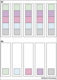
Tom and I wrote our paper after many nights in the field spent dissecting coral reef fishes to recover new species of parasitic worms - a time consuming and sometimes tedious process (sometimes thrilling too, depending on what you do or don't find).  We were often motivated by another far more important factor too - when can we stop all this bloody sampling so that we can go and have a beer on the beach?!?   Species accumulation curves therefore have a very practical aspect to them - they tell you when its OK to stop sampling because you've either sampled all the available species, OR, you've sampled enough to extrapolate a good estimate of how many species there might be.

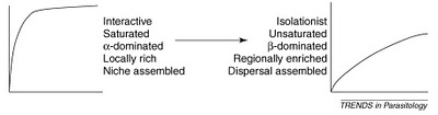
Back to Eric Seabloom.  He and his colleagues wrote a paper about the diversity of aphid-borne viruses infecting grasses of the US Pacific northwest and Canada.  While the environment that they sampled was about as far away as its possible to be from the coral reefs that Tom and I looked at, the patterns of saturated and unsaturated communities they observed were the same. I get a huge buzz out of that, and that out of the morass of published science out there, Dr. Seabloom found a scientific kindred spirit who had had the same thoughts and ideas about nature, however different the specific areas of study.  While Tom and I sipped beers on the beach and watched the sunset over the reef, I wonder if Eric and his colleagues blew the froth off a few while they watched the wind waves spread across the grasslands.  There's something so unifying about science; it can give you common ground with someone you never would have otherwise known, and that's just one reason why I love it so much.

*The tendency for a continuing application of effort or skill toward a particular project or goal to decline in effectiveness after a certain level of result has been achieved. Answers.com 

DOVE, A., & CRIBB, T. (2006). Species accumulation curves and their applications in parasite ecology Trends in Parasitology, 22 (12), 568-574 DOI: 10.1016/j.pt.2006.09.008

ERIC W. SEABLOOM, ELIZABETH T. BORER, CHARLES E. MITCHELL, & ALISON G. POWER (2010). Viral diversity and prevalence gradients in North American Pacific Coast grasslands Ecology, 91 (3), 721-732 (doi:10.1890/08-2170.1)

Reader Comments (3)

Nice piece, and great title. The next time I am teaching students how to generate species accumulation curves and perform rarefaction, I am setting it up with "when can we have a beer" as the problem we are really solving.

Because it *is* the problem we are really solving.

March 31, 2010 | Unregistered CommenterAnonymous
Sad I missed this post the first time around! I love it. I use rarefaction curves all the time. Now that I do more genetics, I've applied the methodology to see how well I've sampled haplotypes in a population. Craig also applied <a href="http://deepseanews.com/2009/04/biodiversity-pt-1-richness-vs-evenness-or-what-kinds-of-beer-are-in-my-refrigerator/"> the beer metaphor to biodiversity measures in a post last year</a>.
September 14, 2010 | Unregistered CommenterKevin Z
Ha! Great minds think alike!
September 14, 2010 | Registered CommenterAl Dove

PostPost a New Comment

Enter your information below to add a new comment.

My response is on my own website »
Author Email (optional):
Author URL (optional):
Post:
 
All HTML will be escaped. Hyperlinks will be created for URLs automatically.