Networked Blogs
Search this site
Twitter and News feeds
Navigation

Entries in ecology (7)

Sunday
Jun062010

I'm baaaa-aaaaack...

Just returned from two weeks on the road, so I've got mounds of work to catch up on.  In the meantime, check out this interesting post over at Thomas' Plant Related Blog.  Its about Neutral Theory and why there are so many species distributed the way they are.  The ecology of diversity is one of my pet research areas, or at least, I like to think about it a lot (see earlier DTF posts about it here and here)

Monday
May312010

Take a Levy walk on the wild side

ResearchBlogging.orgI've mentioned before that this summer I’ll be part of some whale shark field work studies in Mexico. Some of it will focus on how these amazing animals find patches of their planktonic food in the ocean. There’s a pretty good likelihood that they have an incredibly sensitive sense of smell and can detect food from miles away. They’re a bit different than toothy sharks though, because they aren’t detecting “blood in the water” as such; rather, they need to be able to distinguish patches of ocean where plankton is denser from places where its less dense. How do they do that, and what chemicals are they smelling exactly? These are among the questions we will be trying to answer.

In reading up for this work, I came across the idea of Levy Walks. This is not a walk in the sense of your evening constitutional down to the Piggly Wiggly for a 6-pack and some Slim Jims. No, it really is just the name for a certain pattern of animal movement (shown at the right), one in which animals make several short “legs” of directed motion, usually in bunches, separated by longer legs with major reorientations. Its not random motion, but neither is it all that predictable, except that the pattern exists at all scales: its fractal. In other words, if we sketched the motion of an animal on paper, and drew it to scale, it would look similar if we zoomed out to the range of kilometers instead of meters and drew the pattern again. It turns out that moving by way of Levy walks increases your chances of running into patches of food, or the trails of scent they leave behind. At that point, more directed motion takes over and the animal zig zags towards the source of that delicious scent (whereupon it becomes not too different from homing in on the Slim Jims at the Piggly Wiggly after all). Sims et al. show that Levy walks are almost ubiquitous among animals that seek mobile prey; they conclude that its a sort of biological rule for finding food that has a patchy distribution.

It’s a fascinating idea; I wonder if you could apply a deliberate Levy walk pattern if you were looking for your sunglasses, trying to find Waldo, or trying to find an empty patch of beach to put your towel on. People might look at you a bit funny, but who’d have the last laugh?

Sims, D., Southall, E., Humphries, N., Hays, G., Bradshaw, C., Pitchford, J., James, A., Ahmed, M., Brierley, A., Hindell, M., Morritt, D., Musyl, M., Righton, D., Shepard, E., Wearmouth, V., Wilson, R., Witt, M., & Metcalfe, J. (2008). Scaling laws of marine predator search behaviour Nature, 451 (7182), 1098-1102 DOI: 10.1038/nature06518

Thursday
May202010

12,081ft - The oceans, by the numbers

I was inspired by recent articles highlighting a revised calculation of the ocean’s average depth as 12,081ft, to consider the seas in a numerical light today. To that end, here’s a few random, sourced numbers and back-of-the-envelope calculations that might be food for thought:

0.87% = Amount we can see by diving from the surface (about 100ft) over the average depth
0.28% = Amount we can see by diving over the deepest part (Challenger Deep, Marianas Trench off the Philippines)
2.9 = Number of times deeper the deepest part is, compared to the average.
5,400 = Number of mammal species in the world
25,000 = Number of fish species in the world
Millions? = Number of marine invertebrates species in the world (no-one really knows)
2.3 Million = The number of US citizens directly dependent on ocean industries (source: NOAA)
$117 Billion = Value of ocean products and services to the US economy (yr 2000, source: NOAA)
50% = US population living in coastal zones
48% = The proportion of all human-produced CO2 absorbed by the oceans in the Industrial era (NatGeo)
0.1 = The pH drop in the surface oceans since 1900
0.35 = Expected pH drop by 2100 (source)
18 = The number of times more heat absorbed by the oceans than the atmosphere since 1950 (source - TAMU). Global warming is an ocean process far more than an atmospheric one.
3.5 Million = Estimated tons of plastic pollution circling in the Great Pacific Garbage Patch, and growing.

And yet:

30 = Number of times thicker the atmosphere is (out to the “edge of space” about 60 miles) than the average ocean. That would be the atmosphere that astronauts describe as a “thin veneer” on the planet…
0.06% = Thickness of the average ocean, compared to the radius of the earth. I think we can argue that the water is the veneer, not the air
$4.48 Billion = NOAA’s 2010 budget, including the National Ocean Service, Weather Service and Fisheries Services. (source NOAA)
$18.7 Billion = NASA’s 2010 budget, i.e. 4 times the size of the agency that looks after our own planet (source NASA)
$664 Billion = Department of Defense base budget 2010, not counting special allocations (source DoD)
0.6% = The amount you would need to cut Defense in order to double the NOAA budget

Some sources:
http://www.corporateservices.noaa.gov/~nbo/FY10_BlueBook/NOAAwide_One_Pager051109.pdf
http://www.corporateservices.noaa.gov/~nbo/10bluebook_highlights.html http://news.nationalgeographic.com/news/2004/07/0715_040715_oceancarbon_2.html  
http://oceanworld.tamu.edu/resources/oceanography-book/oceansandclimate.htm
http://web.archive.org/web/20080625100559/http://www.ipsl.jussieu.fr/~jomce/acidification/paper/Orr_OnlineNature04095.pdf  

Monday
May172010

Seaweeds and corals go through the media meat-grinder

ResearchBlogging.org“If it bleeds it leads” is a common meme in the journalism field, but when it becomes the mantra of science reporting, sometimes the real message gets lost in translation. Unfortunately, so it is with a new paper from Doug Rasher and Mark Hay down the road at Georgia Tech. In their work, published in PNAS this week, they show that algae from coral reefs can have toxic effects on adjacent corals including bleaching (expulsion of the symbiotic algae that are responsible for much of the corals success) and even death. They provide evidence that these effects are mediated by lipid soluble compounds and that they are much reduced on reefs that have healthy herbivorous fish populations to keep the algae in check. There, I summarized their work in 2 sentences. It’s disappointing, then, that the NSF (NSF for goodness sake!) turned that into “Killer Seaweed: Scientists Find First Proof that Chemicals from Seaweeds Damage Coral on Contact”. Unfortunately, that kind of catch-phrase gets picked up all over, so that MSNBC ran with “Killer seaweed threatens corals: Innocent-looking species turns into an assassin of nearby reefs” (assassin? Really?!). The Georgia Tech website went with “Research shows that chemicals from seaweed kills corals on contact”. Not as dramatic perhaps, but more reasonable. Ed Yong at Discover Blogs chose to emphasise the fish side of the story: “Overfishing gives toxic seaweeds an edge in their competition with corals”; both these seem fine to me, but honestly, I don’t know what’s wrong with using the title of the paper “Chemically rich seaweeds poison corals when not controlled by herbivores”. I think Rasher and Hay did a good job distilling the essence of the paper into a punchy and information-dense title. In any case, its frustrating to see crux of a paper lost in attempts to sensationalise the story, as did all the outlets who went with the “killer seaweed” theme.

Putting aside the press treatment, I think there’s an important part of the story missing from this paper. In it, Rasher and Hay report that in the absence of herbivores, 40-70% of common seaweeds cause bleaching of a model coral species (Porites), depending on where you are. If you average that – 55% - then roughly half of seaweeds were toxic to their model coral. On this proportion and their comparison of overfished and non-overfished reefs, they base the conclusion that these algae are bad for corals, that herbivores suppress the algae and, therefore, that overfishing will increase coral declines by allowing toxic algae to proliferate. All of these seem reasonable ideas, but I kept asking myself: what about the reciprocal effect? What percentage of corals are antagonistic to algae? If, say, half of all corals can damage adjacent algae, then the net effect of all this antagonism at the largest scale is zero. If half of algae kill corals and half of corals kill algae, it could be zero sum. This seems important to me, because it would undermine the conclusion that overfishing of herbivores will necessarily lead to declines in reef corals. Indeed, I could make the reverse argument that overfishing of corallivores (fish that eat corals) might lead to proliferation of corals and therefore the decline of reef algae. We just don't know because that work hasnt been done. 

Of course, you can’t include everything in a single paper and I would expect the authors to respond to my point by saying that the experiments I describe were beyond the scope of their project. But I think it could have been a better paper if they acknowledged that there’s another possibility that cannot be excluded, based on work that’s yet to be done.

Rasher, D., & Hay, M. (2010). Chemically rich seaweeds poison corals when not controlled by herbivores Proceedings of the National Academy of Sciences DOI: 10.1073/pnas.0912095107

Monday
Apr122010

SAC's revisited

ResearchBlogging.orgA little while back I wrote about how we can use Species Accumulation Curves to learn stuff about the ecology of animal, as well as to decide when we can stop sampling and have a frosty beverage. There’s a timely paper in this month’s Journal of Parasitology by Gerardo Pérez-Ponce de Leon and Anindo Choudhury about these curves (let’s call them SACs) and the discovery of new parasite species in freshwater fishes in Mexico. Their central question was not “When can we stop sampling and have a beer?” so much as “When will we have sampled all the parasites in Mexican freshwaters?”. They conclude, based on “flattening off” of their curves (shown below, especially T, C and N), that researchers have discovered the majority of new species for many major groups of parasites and that we can probably ease up on the sampling.

Trying to wrap your arms (and brain) around an inventory of all the species in a group(s) within a region is a daunting task, and I admire Pérez-Ponce de Leon and Choudhury for trying it, but I have some problems with the way they used SACs to do it, and these problems undermine their conclusions somewhat.

In their paper, the authors say “we used time (year when each species was recorded) as a measure of sampling effort” and the SACs they show in their figures have “years” on the X-axis. Come again? The year when each species was recorded may be useful for displaying the results of sampling effort over time, but its no measure of the effort itself. Why is this a problem? For two reasons. Firstly, a year is not a measure of effort, it’s a measure of time; time can only be used as a measure of effort if you know that effort per unit of time is constant, which it is clearly not; there’s no way scientists were sampling Mexican rivers at the same intensity in 1936 that they did in 1996. To put it more generally: we could sample for two years and make one field trip in the first year and 100 field trips in the next. The second year will surely return more new species, so to equate the two years on a chart is asking for trouble. Effort is better measured in number of sampling trips, grant dollars expended, nets dragged, quadrats deployed or (in this case) animals dissected, not a time series of years. The second problem is that sequential years are not independent of each other, as units of sampling effort are (supposed to be). If you have a big active research group operating in 1995, the chances that they are still out there finding new species in 1996 is higher than in 2009; just the same as the weather today is likely to bear some relationship to the weather yesterday.

OK, so what do the graphs in this paper actually tell us? Well, without an actual measure of effort, not much, unfortunately; perhaps only that there was a hey-day for Mexican fish parasite discovery in the mid-1990’s. It is likely, maybe even probable, that this pattern represents recent changes in sampling effort, more than any underlying pattern in biology. More importantly, perhaps, the apparent flattening off of the curves (not all that convincing to me anyway), which they interpret to mean that the rate of discovery is decreasing, may be an illusion. I bet there are tons of new parasite species yet to discover in Mexican rivers and lakes, but without a more comprehensive analysis, it’s impossible to tell for sure.

There is one thing they could have done to help support their conclusion. If they abandoned the time series and then made an average curve by randomizing the order of years on the x-axis a bunch of times, that might tell us something; this would be a form of rarefaction. The averaging process will smooth out the curve, giving us a better idea of when, if ever, they flatten off, and thereby allowing a prediction of the total number of species we could expect to find if we kept sampling forever. Sometimes that mid-90’s increase will occur early in a randomised series, sometimes late, and the overall shape for the average curve will be the more “normal” concave-down curve from my previous post, not the S-shape that they found.  After randomizing, their x-axis would no longer be a “calendar” time series, just “years of sampling” 1, 2, 3… etc.  There's free software out there that will do this for you: EstimateS by Robert Colwell at U.Conn.

The raw material is there in this paper, it just needs a bit more work on the analysis before they can stop sampling and have their cervezas.

Perez-Ponce de León, G. and Choudhury, A. (2010). Parasite Inventories and DNA-based Taxonomy: Lessons from Helminths of Freshwater Fishes in a Megadiverse Country Journal of Parasitology, 96 (1), 236-244 DOI: 10.1645/GE-2239.1

Saturday
Apr102010

Field locations you have loved

In this thread I want to hear about field locations YOU have loved, and WHY.  Here's a couple of mine to get the ball rolling:

Kedron Brook, Brisbane, Australia.  A choked little stretch of suburban creek on the north east side of Brisbane Australia was a key field location for my PhD research, which was all about introduced (exotic) species and their parasites in rivers and streams in Australia.  At one point just above the tidal influence - stylishly named KB216 for its map reference - this creek is basically completely exotic: plants, invertebrates, fish, the whole shebang.  There aren't many parasites there, but those that were present were introduced hitchhikers.  Not sexy, but a veritable Shangri-La for a student on the hunt for ferals...
Heron Island, Queensland, Australia.  Where I met and fell in love with marine biology.  A patch of sand and guano-reeking Pisonia forest 800m long, on a reef 10 times that size, crawling with noddies, shearwaters, turtles, grad students and squinting daytrippers or more wealthy sunburned resort guests.  Too many firsts for me there to even list (but no, not that one - get your mind out of the gutter!).  Absolute heaven, hands-down.  How do I get back?

Throgs Neck, NY, USA.  You generally wouldn't think of the junction of Queens and the Bronx as a biologically interesting in any way (except maybe on the subway), but actually the western part of Long Island Sound was the epicenter of a lobster holocaust that started in (well, before, if you ask me) 1999.  When we were out on the RV Seawolf, the Throgs Neck bridge marked your entry into the East River and the start of one of the most unique and strangely beautiful urban research cruises around, right down the East side of Manhattan, past the Statue of Liberty and out into the Lower NY bays.  We would pass through on our way to do winter flounder spawning surveys off the beach at Coney Island (its that or go around Montauk).  Proof that not all interesting biology takes place in Peruvian rainforests...

In the comments, tell us about a field location YOU have loved and why.  Post links if you can find them.

Wednesday
Mar312010

When can we stop sampling and have a beer?

This post was chosen as an Editor's Selection for ResearchBlogging.orgResearchBlogging.org

Yesterday I got a very kind email from a fellow scientist, Eric Seabloom at Oregon State University, letting me know that a paper I wrote with my PhD advisor Tom Cribb (University of Queensland) a few years ago had influenced a recent publication of his.  My paper was about one of those patterns in nature that just seem to be universal.  They're called species accumulation curves and, at the heart of it, they represent the "law of diminishing returns"* as it applies to sampling animals in nature. Basically, they show that when you first start looking for animals - maybe in a net, a trap or a 
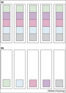
quadrat - pretty much everything you find is new to you, but as you go along, you find fewer and fewer new species, until eventually you don't find any more new species.  Simple, maybe even obvious, right?  Well it turns out that that simple observation has embedded within it all sorts of useful information about the way animal diversity is spread around, and even about how animals interact with each other in nature.  Consider the figure on the above right, which represents two sets of 5 samples (the tall boxes), containing different animal species (the smaller coloured boxes).  The first thing to note is that both set (a) and set (b) consist of 5 samples, and both have a total diversity of 5 species (i.e. 5 different colours).  In set (a), all the diversity is present in every sample, but in set (b) there's only one species per sample, so you have to look at all 5 samples before you find all 5 species.  If you were to plot a graph of these findings, you'd get very different 
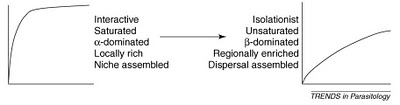
species accumulation curves; they would both end at 5 species, but they would be shaped differently.  They'd look much like what you see below:

 Set (a) would be more like the curve on the left (in fact, it would be a perfect right angle), while set (b) would be more like the curve on the right (in fact, it would be a straight diagonal line).  You can see some other properties on the two types of curves above also, for the more ecologically inclined, but the gist is, the shape of the curves means something about the communities they describe.

Tom and I wrote our paper after many nights in the field spent dissecting coral reef fishes to recover new species of parasitic worms - a time consuming and sometimes tedious process (sometimes thrilling too, depending on what you do or don't find).  We were often motivated by another far more important factor too - when can we stop all this bloody sampling so that we can go and have a beer on the beach?!?   Species accumulation curves therefore have a very practical aspect to them - they tell you when its OK to stop sampling because you've either sampled all the available species, OR, you've sampled enough to extrapolate a good estimate of how many species there might be.

Back to Eric Seabloom.  He and his colleagues wrote a paper about the diversity of aphid-borne viruses infecting grasses of the US Pacific northwest and Canada.  While the environment that they sampled was about as far away as its possible to be from the coral reefs that Tom and I looked at, the patterns of saturated and unsaturated communities they observed were the same. I get a huge buzz out of that, and that out of the morass of published science out there, Dr. Seabloom found a scientific kindred spirit who had had the same thoughts and ideas about nature, however different the specific areas of study.  While Tom and I sipped beers on the beach and watched the sunset over the reef, I wonder if Eric and his colleagues blew the froth off a few while they watched the wind waves spread across the grasslands.  There's something so unifying about science; it can give you common ground with someone you never would have otherwise known, and that's just one reason why I love it so much.

*The tendency for a continuing application of effort or skill toward a particular project or goal to decline in effectiveness after a certain level of result has been achieved. Answers.com 

DOVE, A., & CRIBB, T. (2006). Species accumulation curves and their applications in parasite ecology Trends in Parasitology, 22 (12), 568-574 DOI: 10.1016/j.pt.2006.09.008

ERIC W. SEABLOOM, ELIZABETH T. BORER, CHARLES E. MITCHELL, & ALISON G. POWER (2010). Viral diversity and prevalence gradients in North American Pacific Coast grasslands Ecology, 91 (3), 721-732 (doi:10.1890/08-2170.1)