Navigation
Twitter and News feeds
Search this site
Networked Blogs

Entries in species accumulation curves (4)

Sunday
Jun062010

I'm baaaa-aaaaack...

Just returned from two weeks on the road, so I've got mounds of work to catch up on.  In the meantime, check out this interesting post over at Thomas' Plant Related Blog.  Its about Neutral Theory and why there are so many species distributed the way they are.  The ecology of diversity is one of my pet research areas, or at least, I like to think about it a lot (see earlier DTF posts about it here and here)

Monday
May102010

Mountains of Pelagic Diversity

ResearchBlogging.org

If you ever saw the dramatic seamount scene in Blue Planet (and if you haven’t, where ya been??), then you are probably familiar with the idea that submarine mountains can attract lots of animals; as Attenborough puts it, they “create oases where life can flourish in the comparatively empty expanses of the open ocean”.  In that spectacular BBC sequence, jacks and tuna swarm an Eastern Pacific seamount peppered with colourful schools of barberfish, Anthias and goatfish.  Then the sharks cruise in, including silkys and hammerheads, there for a clean from the faithful barberfish.
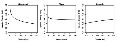
There’s a paper in the latest issue of PNAS that quantifies the richness of seamounts, so beautifully depicted by those geniuses at the BBC Documentary department.  The authors, led by Telmo Morato from the Secretariat of the Pacific Community in New Caledonia, analysed data gathered by longline fisheries in the western and central Pacific, close to and remote from seamounts .  In a sense, a longline is a standardized sort of sampling unit like a quadrat, so they can be analysed across locations to measure differences in diversity.  They accounted for differences between total catch per longline using the statistical process called rarefaction which is a practical application of one of my favourite fundamental biological patterns – the species accumulation curve - which I’ve discussed before (here and here).  It looks like a great dataset with great spatial resolution and pretty good coverage in the tropics, though the equatorial zones are less well-represented.
I don’t think anyone would be surprised by their result that, yes, seamounts are diverse places.  When they broke it down by species, about 2/5 (15 species) showed positive association with seamounts; this group included both sharks and fish.  Interestingly, 3 species (pelagic stingrays, albacore and shortbilled spearfish) showed negative associations with seamounts, while 19 showed no measurable association.  So, the net effect is positive, but there's clearly some structure in the data, depending on what species you look at.  Nor, I think , would most people be surprised by the distance effect they found, wherein sample diversity decreased with distance moved away from the peak of a seamount, and most sharply in the first 10 or so kilometers.  What was surprising, to me at least, was that both the absolute diversity and the distance effect they found were greater on seamounts (left) than they were for coastal zones (center). 
I would have thought that coastal zones, with their larger area, more complex topography and currents, coastal upwelling and inputs from the land, should have had higher diversity.  Indeed, it kind of goes against the island biogeography ideas, that as we go away from the largest habitat towards smaller more distant patches, diversity drops; if you think of seamounts as underwater islands and continental shelves as underwater mainlands, perhaps you’ll see what I mean.
There’s a couple of reasons I can think of to explain the observed difference.  Perhaps there is something intrinsic to seamounts, some feature of topography or productivity that makes them real magnets for diversity.  Under this scenario, they are true biodiversity hotspots.  Alternatively, perhaps coastal zones once were more diverse than seamounts but have been denuded by our actions, so that only the remote and submarine mountains remain as examples of what once was.  Perhaps it’s a bit of both, or some other concept (that you should propose in the comments).  Either way, Morato et al. show us that we may be successful at protecting widely roaming pelagic species by strategically preserving relatively tiny specks of submarine oases.  Since reading their paper, I have enjoyed thinking of schools of pelagics, hopping from mountaintop to mountaintop, skipping across vast plains of abyssal ocean, and as usual dreaming about diversity and all the fantastic forms of life in the 3D wonderland of the open ocean.  It just makes you want to down tools and grab the next slow boat bound for Cocos, doesn't it?

Morato, T., Hoyle, S., Allain, V., & Nicol, S. (2010). Seamounts are hotspots of pelagic biodiversity in the open ocean Proceedings of the National Academy of Sciences DOI: 10.1073/pnas.0910290107

Monday
Apr122010

SAC's revisited

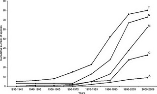
ResearchBlogging.orgA little while back I wrote about how we can use Species Accumulation Curves to learn stuff about the ecology of animal, as well as to decide when we can stop sampling and have a frosty beverage. There’s a timely paper in this month’s Journal of Parasitology by Gerardo Pérez-Ponce de Leon and Anindo Choudhury about these curves (let’s call them SACs) and the discovery of new parasite species in freshwater fishes in Mexico. Their central question was not “When can we stop sampling and have a beer?” so much as “When will we have sampled all the parasites in Mexican freshwaters?”. They conclude, based on “flattening off” of their curves (shown below, especially T, C and N), that researchers have discovered the majority of new species for many major groups of parasites and that we can probably ease up on the sampling.

Trying to wrap your arms (and brain) around an inventory of all the species in a group(s) within a region is a daunting task, and I admire Pérez-Ponce de Leon and Choudhury for trying it, but I have some problems with the way they used SACs to do it, and these problems undermine their conclusions somewhat.

In their paper, the authors say “we used time (year when each species was recorded) as a measure of sampling effort” and the SACs they show in their figures have “years” on the X-axis. Come again? The year when each species was recorded may be useful for displaying the results of sampling effort over time, but its no measure of the effort itself. Why is this a problem? For two reasons. Firstly, a year is not a measure of effort, it’s a measure of time; time can only be used as a measure of effort if you know that effort per unit of time is constant, which it is clearly not; there’s no way scientists were sampling Mexican rivers at the same intensity in 1936 that they did in 1996. To put it more generally: we could sample for two years and make one field trip in the first year and 100 field trips in the next. The second year will surely return more new species, so to equate the two years on a chart is asking for trouble. Effort is better measured in number of sampling trips, grant dollars expended, nets dragged, quadrats deployed or (in this case) animals dissected, not a time series of years. The second problem is that sequential years are not independent of each other, as units of sampling effort are (supposed to be). If you have a big active research group operating in 1995, the chances that they are still out there finding new species in 1996 is higher than in 2009; just the same as the weather today is likely to bear some relationship to the weather yesterday.

OK, so what do the graphs in this paper actually tell us? Well, without an actual measure of effort, not much, unfortunately; perhaps only that there was a hey-day for Mexican fish parasite discovery in the mid-1990’s. It is likely, maybe even probable, that this pattern represents recent changes in sampling effort, more than any underlying pattern in biology. More importantly, perhaps, the apparent flattening off of the curves (not all that convincing to me anyway), which they interpret to mean that the rate of discovery is decreasing, may be an illusion. I bet there are tons of new parasite species yet to discover in Mexican rivers and lakes, but without a more comprehensive analysis, it’s impossible to tell for sure.

There is one thing they could have done to help support their conclusion. If they abandoned the time series and then made an average curve by randomizing the order of years on the x-axis a bunch of times, that might tell us something; this would be a form of rarefaction. The averaging process will smooth out the curve, giving us a better idea of when, if ever, they flatten off, and thereby allowing a prediction of the total number of species we could expect to find if we kept sampling forever. Sometimes that mid-90’s increase will occur early in a randomised series, sometimes late, and the overall shape for the average curve will be the more “normal” concave-down curve from my previous post, not the S-shape that they found.  After randomizing, their x-axis would no longer be a “calendar” time series, just “years of sampling” 1, 2, 3… etc.  There's free software out there that will do this for you: EstimateS by Robert Colwell at U.Conn.

The raw material is there in this paper, it just needs a bit more work on the analysis before they can stop sampling and have their cervezas.

Perez-Ponce de León, G. and Choudhury, A. (2010). Parasite Inventories and DNA-based Taxonomy: Lessons from Helminths of Freshwater Fishes in a Megadiverse Country Journal of Parasitology, 96 (1), 236-244 DOI: 10.1645/GE-2239.1

Wednesday
Mar312010

When can we stop sampling and have a beer?

This post was chosen as an Editor's Selection for ResearchBlogging.orgResearchBlogging.org

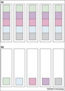
Yesterday I got a very kind email from a fellow scientist, Eric Seabloom at Oregon State University, letting me know that a paper I wrote with my PhD advisor Tom Cribb (University of Queensland) a few years ago had influenced a recent publication of his.  My paper was about one of those patterns in nature that just seem to be universal.  They're called species accumulation curves and, at the heart of it, they represent the "law of diminishing returns"* as it applies to sampling animals in nature. Basically, they show that when you first start looking for animals - maybe in a net, a trap or a quadrat - pretty much everything you find is new to you, but as you go along, you find fewer and fewer new species, until eventually you don't find any more new species.  Simple, maybe even obvious, right?  Well it turns out that that simple observation has embedded within it all sorts of useful information about the way animal diversity is spread around, and even about how animals interact with each other in nature.  Consider the figure on the above right, which represents two sets of 5 samples (the tall boxes), containing different animal species (the smaller coloured boxes).  The first thing to note is that both set (a) and set (b) consist of 5 samples, and both have a total diversity of 5 species (i.e. 5 different colours).  In set (a), all the diversity is present in every sample, but in set (b) there's only one species per sample, so you have to look at all 5 samples before you find all 5 species.  If you were to plot a graph of these findings, you'd get very different species accumulation curves; they would both end at 5 species, but they would be shaped differently.  They'd look much like what you see below:

 Set (a) would be more like the curve on the left (in fact, it would be a perfect right angle), while set (b) would be more like the curve on the right (in fact, it would be a straight diagonal line).  You can see some other properties on the two types of curves above also, for the more ecologically inclined, but the gist is, the shape of the curves means something about the communities they describe.

Tom and I wrote our paper after many nights in the field spent dissecting coral reef fishes to recover new species of parasitic worms - a time consuming and sometimes tedious process (sometimes thrilling too, depending on what you do or don't find).  We were often motivated by another far more important factor too - when can we stop all this bloody sampling so that we can go and have a beer on the beach?!?   Species accumulation curves therefore have a very practical aspect to them - they tell you when its OK to stop sampling because you've either sampled all the available species, OR, you've sampled enough to extrapolate a good estimate of how many species there might be.

Back to Eric Seabloom.  He and his colleagues wrote a paper about the diversity of aphid-borne viruses infecting grasses of the US Pacific northwest and Canada.  While the environment that they sampled was about as far away as its possible to be from the coral reefs that Tom and I looked at, the patterns of saturated and unsaturated communities they observed were the same. I get a huge buzz out of that, and that out of the morass of published science out there, Dr. Seabloom found a scientific kindred spirit who had had the same thoughts and ideas about nature, however different the specific areas of study.  While Tom and I sipped beers on the beach and watched the sunset over the reef, I wonder if Eric and his colleagues blew the froth off a few while they watched the wind waves spread across the grasslands.  There's something so unifying about science; it can give you common ground with someone you never would have otherwise known, and that's just one reason why I love it so much.

*The tendency for a continuing application of effort or skill toward a particular project or goal to decline in effectiveness after a certain level of result has been achieved. Answers.com 

DOVE, A., & CRIBB, T. (2006). Species accumulation curves and their applications in parasite ecology Trends in Parasitology, 22 (12), 568-574 DOI: 10.1016/j.pt.2006.09.008

ERIC W. SEABLOOM, ELIZABETH T. BORER, CHARLES E. MITCHELL, & ALISON G. POWER (2010). Viral diversity and prevalence gradients in North American Pacific Coast grasslands Ecology, 91 (3), 721-732 (doi:10.1890/08-2170.1)