SAC's revisited
![]() A little while back I wrote about how we can use Species Accumulation Curves to learn stuff about the ecology of animal, as well as to decide when we can stop sampling and have a frosty beverage. There’s a timely paper in this month’s Journal of Parasitology by Gerardo Pérez-Ponce de Leon and Anindo Choudhury about these curves (let’s call them SACs) and the discovery of new parasite species in freshwater fishes in Mexico. Their central question was not “When can we stop sampling and have a beer?” so much as “When will we have sampled all the parasites in Mexican freshwaters?”. They conclude, based on “flattening off” of their curves (shown below, especially T, C and N), that researchers have discovered the majority of new species for many major groups of parasites and that we can probably ease up on the sampling.
A little while back I wrote about how we can use Species Accumulation Curves to learn stuff about the ecology of animal, as well as to decide when we can stop sampling and have a frosty beverage. There’s a timely paper in this month’s Journal of Parasitology by Gerardo Pérez-Ponce de Leon and Anindo Choudhury about these curves (let’s call them SACs) and the discovery of new parasite species in freshwater fishes in Mexico. Their central question was not “When can we stop sampling and have a beer?” so much as “When will we have sampled all the parasites in Mexican freshwaters?”. They conclude, based on “flattening off” of their curves (shown below, especially T, C and N), that researchers have discovered the majority of new species for many major groups of parasites and that we can probably ease up on the sampling.
Trying to wrap your arms (and brain) around an inventory of all the species in a group(s) within a region is a daunting task, and I admire Pérez-Ponce de Leon and Choudhury for trying it, but I have some problems with the way they used SACs to do it, and these problems undermine their conclusions somewhat.
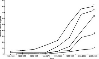
OK, so what do the graphs in this paper actually tell us? Well, without an actual measure of effort, not much, unfortunately; perhaps only that there was a hey-day for Mexican fish parasite discovery in the mid-1990’s. It is likely, maybe even probable, that this pattern represents recent changes in sampling effort, more than any underlying pattern in biology. More importantly, perhaps, the apparent flattening off of the curves (not all that convincing to me anyway), which they interpret to mean that the rate of discovery is decreasing, may be an illusion. I bet there are tons of new parasite species yet to discover in Mexican rivers and lakes, but without a more comprehensive analysis, it’s impossible to tell for sure.
There is one thing they could have done to help support their conclusion. If they abandoned the time series and then made an average curve by randomizing the order of years on the x-axis a bunch of times, that might tell us something; this would be a form of rarefaction. The averaging process will smooth out the curve, giving us a better idea of when, if ever, they flatten off, and thereby allowing a prediction of the total number of species we could expect to find if we kept sampling forever. Sometimes that mid-90’s increase will occur early in a randomised series, sometimes late, and the overall shape for the average curve will be the more “normal” concave-down curve from my previous post, not the S-shape that they found. After randomizing, their x-axis would no longer be a “calendar” time series, just “years of sampling” 1, 2, 3… etc. There's free software out there that will do this for you: EstimateS by Robert Colwell at U.Conn.
The raw material is there in this paper, it just needs a bit more work on the analysis before they can stop sampling and have their cervezas.
Perez-Ponce de León, G. and Choudhury, A. (2010). Parasite Inventories and DNA-based Taxonomy: Lessons from Helminths of Freshwater Fishes in a Megadiverse Country Journal of Parasitology, 96 (1), 236-244 DOI: 10.1645/GE-2239.1

 Share Article
Reader Comments